30 December 2015

A new creative outlet (and passion...)

EYES

I admit it - I'm pretty hooked!  Given my addictive personality, it shouldn't come as much of a surprise, really...  I've just completed my FIRST EVER art journal page and I LOVE IT!
I'm about to embark on a year-long adventure through mixed media and art journalling, called WANDERLUST.  It is an online adventure over 50 weeks in 2016 starting on 1 January.  There will be a new video each week detailing different aspects of this amazing creative outlet, including videos on products and techniques from 2 resident teachers, as well as videos from 24 guest teachers (each one downloadable and with PDF instructions provided).

I can't wait to get started!!

D.xx

08 December 2015

The Caring Hearts Card Drive 2016 ~ Wrap-up

Well, the Caring Hearts Card Drive is over for another year!  I've managed to collect a total of 380 cards from local cardmaking friends in Melbourne, and these have been packed up into deliveries to go to five different aged care facilities across the suburbs.  To combine these with the cards sent directly to Linda, that makes a total of 1,100 cards collected and distributed across 13 aged care facilities in Australia for 2016 - such a great effort!

For my own part, I've made roughly 200 cards for this cause, with over 130 of them being utilised in a mini-fundraiser at my children's primary school.  Below is a photo showing some of the beautiful messages written by the primary students:
They're so very colourful!  Here is a quick photo showing a group of different designs I made for the school:
This is such a fantastic initiative, and I hope to be involved again next year!!

Deb.xx

01 December 2015

Pixels and Paper ~ December Challenge!

2010

WOW, I blinked and November was gone!!  What a busy month!!  Well, we're definitely on the downhill run now, gathering speed towards the festive season!  And Christmas time is exactly what I thought of when I first saw this month's inspiration photo at Pixels and Paper!
This image is so much fun!  I was firstly drawn to the beautiful bright green and red, and to the chocolate and the gingerbread.  I also wanted to incorporate the overall Christmas theme of the bikkies into my layout!  Here's what I came up with!
On a piece of heavy-weight white cardstock, I splattered some watered down 'Melted Chocolate' Dylusions paint and let it dry.  Next I used the Trees stencil from TCW and 'Cut Grass' Dylusions paint with a stipple brush to stencil the trees randomly on the page.  Again, after this was dry, I used 'Postbox Red' Dylusions paint and a fine-point brush to put red dots on the trees.

Next, I used two adorable little gingerbread people stamps from Imaginisce and stamped and white embossed them onto 'ginger-coloured' cardstock.  I fussy-cut them out and arranged them in pairs on the page.  I used my 'Little Numbers' dies from Stampin' Up! to cut out "2010" from the 'ginger-coloured' cardstock, and added some squiggly lines with my Versamark pen and heat-embossed with white.

I used a piece of candy-cane paper from a Kaisercraft paperstack to go under my photo.  I also distressed up some of the 'ginger-coloured' cardstock and put that under where the photo was going to go.

I matted my photo of my kids' Santa photo (from 2010) onto white cardstock and used the 'Postbox Red' Dylusions paint around the edge.  The photo was then popped up over the layers to give dimension.  I also used a diecut from the Kaisercraft paperstack (it was green [tick!] and had Santa on it [tick!] to journal the details of this Santa photo.

I was relatively happy with the page, but it did seem like it was missing something.  I used a mask of an ornament die by Nini's Things and sponged some 'Real Red' ink by Stampin' Up! over the mask and removed it - I did this randomly on the page and I feel it picked it right up.

I can't wait to see what everyone else comes up with this month!!

Cheerio!  Thanks for visiting!!

Deb.xx

15 November 2015

Caring Hearts Card Drive 2015 - Mid-November update

To see my original Caring Hearts Card Drive post, click here.

We're getting to the 'pointy end' of the Caring Hearts Card Drive for 2015.  The lovely Linda Langes has provided an update on the Australian-based component of this drive on her blog.

From my end in Melbourne, I have so far received 15 cards from a wonderful crafty friend of mine, with another 10-12 friends providing me with cards at a crafty event next weekend.  I am also hopeful that some other friends of mine on the other side of town will get into the spirit of the CHCD and send me some cards in the not-too-distant future as well.  Any other Victorian crafter who would like to send cards locally for Victorian-based aged care facilities are welcome to send cards to me as follows:

Details now deleted...

I have so far arranged for up to 300 cards to be delivered to five separate aged care facilities across Melbourne. I stopped at that point as I didn't want to promise cards that I wouldn't necessarily be able to deliver (!).  Once I get cards in from local crafters, I can then set about contacting additional facilities on my list across the broader Victorian area.

For my part personally, I am busy creating cards for students at my kids' school, Bundoora Primary School.  We use this drive as a mini-fundraiser for the school.  I donate the cards to the school, the school then sells the cards to the students and families at $2.00 per card ($0.70 for postage costs back to the CHCD and $1.30 profit for the school's fundraising endeavours).  We had orders for 105 cards as at last Monday - I'm hoping for many more by tomorrow.  Here are some samples of cards I have created this year:


I've had a real thing for 'Christmas Trees' this year, hence these three designs...  I always like to put some 'meaning of Christmas' designs together as well...

I've been having fun playing with my Flitterglu and MegaFlakes from Indigoblu, and using masks of ornament dies to create a reverse effect:


I've also had some fun with some cute little Santa Stamps and my Prismacolour Pencils:
The wonderful students at our school will be sitting down in their classes one morning within the next two weeks to write/draw their messages of festive cheer in these cards.  I'll be sure to post some pictures of their gorgeous work once they're done!

I'm off now to create some more designs - I think I'll do some poinsettias next!

Thanks for visiting!
Deb.xx
#caringheartscarddrive


01 November 2015

Pixels and Paper - November Challenge!

"live gently upon this earth"

 Welcome back to a new month at Pixels and Paper!  We have a fantastic inspiration photo for you to work from for this month's challenge:
I was immediately drawn to the tree and the sense of the changing seasons.  I decided to create a canvas for my piece this month.
I began by drawing pencil lines to break my landscape canvas (9"x12") into quarters.  Next, I used Gelatos and water to create my background sky and ground.  I moved from the deep blue hot sky of Summer into the overcast coolness of Autumn, to the blustery grey skies of Winter, and into the renewing freshness of Spring.  The grass has been modified to match my impression of these changing seasons as well.  After I'd finished the 'watercolour' phase of this process, I then sealed it all using Tim Holtz' Distress 'Micro Glaze'.  This allowed me to keep building on the base images without damaging them.

Then, using the bare tree image from the 'Sheltering Tree' stamp set by Stampin' Up!, together with Dylusions Paint in 'Melted Chocolate', I stamped out my tree in all four settings.  I mixed Dylusions Paint 'Cut Grass' with some Memento 'Tuxedo Black' reinker to get differing shades of green for my leaves for Summer and Spring, and then mixed it further with some 'Melted Chocolate' for Autumn.  I also added some 'Crushed Curry' SU! Reinker for the Autumn leaves as well, and have then built each tree manually.  I added flowers to Spring by mixing 'White Linen' and 'Postbox Red' Dylusions Paint and dabbing the resulting pink randomly.

For a bit of texture, I've added smatterings of Whipped Spackle into the grey skies of Winter, as well as adding some puffy white clouds to Spring.  I also wanted to add some ribbon flowers along the lines of last month's October Training with Tone-Lill - using some 3mm pink ribbon with white cotton to gather them in.  Each of these ribbon flowers has been finished off with a small yellow rhinestone.  I also added a few other rhinestones to the paint flowers as well.

I used some dark green seaming ribbon (different to seam binding ribbon) to segment off the seasons where the pencil lines had been, and I added the phrase "live gently on this earth" from the Tim Holtz 'Small Talk' sticker book.

I can't wait to see what everyone else comes up with!

Thanks for visiting!
Deb.xx

31 October 2015

Scrapbook Boutique - October 2015 Challenge

If you would like to check out my original Caring Hearts Card Drive post, click here!

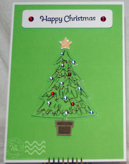
Happy Christmas

Thankfully, I've finally gotten around to creating something to enter this month's Challenge at Scrapbook Boutique (only just!)  Such a wonderful colour combination:
To me, this screams "Christmas"!  [I'm very traditional with my Christmas colours.]  And so, with cards still to design and create for the Caring Hearts Card Drive, I thought I'd use this inspiring colour palette to help me out!
I have used the new 'Perfect Pines' dies and co-ordinating 'Peaceful Pines' stamp set from Stampin' Up! to create my tree.  The diecut of the tree, the star and the pot are all popped up on the card base to add dimension.  I have also threaded some coiled red wire across the tree for tinsel, and added a few Sprinkles for baubles.  My sentiment has been heat embossed with black and popped up, with a few Sprinkles at each end.

This is a really easy design to create, and I am sure I can create a couple more for this year's Card Drive!

Thanks for visiting!
Deb.xx


30 October 2015

Kraft+ ~ Inspired by Nature Challenge

To see my post about the Caring Hearts Card Drive, click here!

Maggies

My, my, how quickly October has disappeared!! I almost didn't make it to enter this month's challenge over at Kraft+ ~ Inspired by Nature!
Thankfully I've been able to get myself a bit organised so I could put together a layout to enter!  My topic for this layout is so in tune with the theme of this challenge - Magpies!  I have a delightful group of Maggies nesting near my house, and instead of being swooped by them anytime I go outside, I decided to make them my friends by feeding them.  Now, when I walk out my door and whistle, they come gliding in and virtually eat out of my hand...
I have used a piece of Corrugated Card from Kaisercraft for my background, and dressed it up with some white gesso and black Gelatos.  I love how the gesso sits in the grooves of the corrugations to add it's own 'layer' of interest...

One of my Maggies was kind enough to leave me a feather which I have incorporated into my title by putting it under my chippie letters.

I have added some string under the photos and popped the photos up on cardboard.  I found some chipboard feathers in my stash that I have coloured with Stampin' Up! Craft Ink in Whisper White and Basic Black to replicate the Magpie feather.  I distressed some black paper by scrunching it up, and then lightly inking up the texture with Whisper White craft ink. 

I also dried and pressed a few tea rose flowers from my [one and only] rose bush to incorporate onto the page and add a bit of colour.  I created my own 'grass' by randomly cutting some bits of green cardstock into blades and stuck together.

It's a very simple page, but I love how it came together.  I love my Maggies and I hope they stay around for many years to come!

26 October 2015

Horror Movie - a spooky layout

To see the Caring Hearts Card Drive post, click here!

Horror Movie


Here is a layout I've done for a Facebook group challenge, the criteria being for it to be spooky!
I've grabbed the solo and class photo from my son's School Production of "Horror Movie" from last year to use as my 'spooky subject'.  He makes such a happy, cute-looking Zombie!

There are a lot of different techniques for this one, starting with using Gelatos and water on the black background to make the eyes and mouth.  Then I distressed around the edges of the cardstock and added DecoArt Metallic Lustre in 'Black Shimmer'.  The torn out edges have been 'filled' with crinkled and distressed red cardstock, and then highlighted with DecoArt Metallic Lustre in 'Radiant Red'.  The green of the eyes has been highlighted with DecoArt Metallic Lustre in 'Elegant Emerald'.  [Can you guess what new products I have to play with??!]

I smeared some Whipped Spackle across the page and heat-set it, and then used the 'Black Shimmer' Metallic Lustre to add stitches.  I've used grey and orange paper, distressed with water and crinkled up, to break up the photos and give the page some interest.  I also mixed up red Gelato with water in a mini mister and sprayed drops of 'blood' on the page.

For my title, I used chipboard letters "H" and "M", and heat embossed them white.  They then got soaked in some Dylusions spray 'Postbox Red' to give the appearance of blood.  The remaining letters were painted onto the background using a couple of layers of Gesso [the negative space of my set of chipboard alphas was used as a guide].  The purple outline of each letter has been made by mixing Gel Medium with 'Crushed Grape' Dylusions spray and outlining each letter with a brush.

Finally, I've added some 'brains' doodling to the top left hand corner, some red, bloodshot eye doodling to the whites of the eyes on the background and a handful of purple grey and black enamel dots.

This layout was a lot of fun to make!  Thanks for stopping by!

Deb.xx

13 October 2015

A 'Special Order' wedding card

To see the Caring Hearts Card Drive post, click here!

Congratulations

Here is a wedding card that I've just made at the request of a friend.  Her brother is getting married, and she wanted to give a handmade card.
I have used a lovely watermarked parchment paper as the 'topper' for the card, and I've used Indigoblu 'Flitterglu' with some silverleaf to gild my bouquet stamp randomly across the topper.  (The bouquet stamp is from the Penny  Black stamp set 'Special Day'.)

The "Congratulations" sentiment is from the [retired] Stampin' Up! set 'Love & Laughter', and it has been stamped in Versafine Onyx Black.

The silhouette die has been cut from smooth grey cardstock.  I've then inked it up with Versamark Dazzle 'Frost' ink, and then heat embossed it with clear embossing powder.  Unfortunately the photo doesn't do it justice - there is a beautiful shimmer under the shine of the clear embossing.

I have also lined the card with the same watermarked parchment paper.

All the best to the soon-to-be-newlyweds!

Deb.xx

11 October 2015

A Quick Layout

 To see the Caring Hearts Card Drive post, click the link!

The Pool

I have put together a quick layout (between cardmaking sessions) to enter into my friend Jodie's Facebook group monthly competition.  The criteria for the month of October was "bright" - okay!!!

I have used a few new products for this layout!  Starting with the Ken Oliver Colour Bursts in blue (and a bit of yellow) - these things are awesome!  What an easy way to create an effective and beautiful background!  I started by 'misting' water over the white background page and then lightly tapping the Colour Burst powder over it to activate the powder where it landed on the mist.  I then sprayed through the middle to create more of a puddle and added a bit of yellow to get a more aqua colour.  Once there was a good amount of liquid, I swirled my brush through in a circular motion, and then tipped the page around to allow the liquid to run in rivulets along the circular pattern.  I played around with this a bit more to get the look I was after.

Next I wanted to create an acetate panel to give some dimension to the page.  But I knew anything I did to the acetate would be lost on the background unless I backed it up with white card.  So I created my panel and backing card and then I used some Dylusions spray and dropped that onto the acetate, and then using a brush and Isocol rubbing alcohol, I worked the colour around on the acetate.  This gave a very cool watery feel.  To add further depth to this element, I used more of the Dylusions ink with Isocol to create the illusion of bubbles and 'water surface variation' at the top of the white card underneath the acetate.  I love how this turned out!

In my 'stash' of scrapbooking papers, I managed to find an old TCW sheet called "Pool" from the Colours of My Life range.  I've fussy-cut out my title 'The Pool" as well as the more sentiment-type thing "Splish Splash".  The colour of the TCW sheet was the wrong blue for my layout.  So I used 'Peacock Feathers' Distress Ink and water, with a brush, to add more of my aqua colour to the title pieces.  I also splatted some of that colour ink over the "Splish Splash" element.

I coloured up two lots of texture paste - one lime/yellow-ish and the other orange to replicate the colour of my kids' goggles in the photos.  This was stencilled on using a Kaisercraft stencil design.  However, once it was dry, the blue from the Colour Bursts on the background and bled through and changed the colour a bit too much.  So I used my Sakura Gelly Roll Pens to re-colour my texture paste.

I did a little tear down the left hand side and put some Stampin' Up! DSP of water behind it, and then used my new DecoArt Metallic Lustre in 'Black Shimmer' around the tear and smeared it along the edges.

The photos have been popped up on cardboard, and some enamel dots and journalling added.  I love how this page has come together and that I got to play with new stuff!!

Deb.xx

10 October 2015

First Design for Caring Hearts Card Drive 2015

To see the Caring Hearts Card Drive post, click here!

"Seasons Greetings"

I just wanted to quickly share my first 'official' card design for this year's Caring Hearts Card Drive.
I had cut out one of the "Delicate Ornaments Thinlits Dies" by Stampin' Up! from some Inkadinkado Masking Paper.  I put that on a piece of cardstock and using the Flitterglu and stamping foam from Indigoblu, I randomly 'inked up' through the mask and around it.  I then applied the "Winter Dawn" Mega Flakes and scrubbed off the excess.  I also applied the Flitterglu around the edges and dipped them into the Winter Dawn Mega Flakes to add that detail around the edges.

I cut out the ornament topper from the "Delicate Ornaments Thinlits Dies using some dark silver shimmer paper and added some of the new "Silver Metallic Thread" by Stampin' Up!  As a final touch, I stamped the sentiment from my JustRite "Christmas Mini Sentiments Set" using Versafine Onyx Black.

I'm rapt with how this came out!  I now want to get more colours of the Mega Flakes to give a different effect.  Also, next time I won't use the masking paper as it perished after one application of the Flitterglu.  Instead, I will try with Xpress It Masking Film instead.

Please get behind the Caring Hearts Card Drive 2015 - it is such a worthy, feel-good thing to do!

Please include #caringheartscarddrive to your social media updates about this event!  It would be awesome for 'kindness' to trend!

Deb.xx

06 October 2015

The Caring Hearts Card Drive

It's time again for the 6th Annual Caring Hearts Card Drive!  This wonderful event came to Australia for the first time last year, and we're at it again in 2015!  The CHCD is the brainchild of Vera Yates (Ling) which she started in 2010, in honour of her mum.  Here's a bit more information directly from Vera's blog post:

"We are back for the 6th year for our annual Caring Hearts Card Drive. The purpose of our card drive is to collect holiday cards for the elderly that lives in nursing homes. I started this card drive 6 years ago, in 2010 in honor of my mom. That first year, we collected 750 cards.
And each year it continue to grow bigger.
Last year we received over 17,000 cards and branched out to Australia!!

It was such an amazing year.

Jennifer McGuire and I are excited to continue this journey and we really hoping that we can bring holiday cheers to many, many more nursing homes. 

We have a few ladies helping us in collecting the cards. Tina Schrof is working with Jennifer in collecting the cards. Since international shipping is expensive, those of you in Canada can mail your cards to Anita or Caroline and they'll distribute the cards. 
And, for those of you in Australia, you can send to Linda.
:)


The holidays are about family, kindness, and joy. During this time many of the elderly who lives in nursing homes would really feel the loneliness or missing their family. Wouldn't it be so awesome if we can bring a smile to their face & brighten their holiday season simply by sharing our love of card making? A simple gesture to let them know that they are not forgotten.
That someone still thinking of them.


We all love making cards and what’s better than knowing our creations can bring a smile to others, right? Some helpful people already agree to help us deliver the cards to selected nursing homes. 

A few important details:

  • This card drive will be going on from October 3 to November 27, 2015. We need to receive your card by November 27, 2015.
  • Please make the cards for Christmas or Holiday Wishes. Anyone can send a card, your children, church group, scout troops, etc.
  • All cards need to have a message in it (it can be stamped or hand written).  
  • Please sign your name and where you are from. 
  • Please include an envelope for each card and please don't seal the envelope.
  • Please stick to just cards (standard size A2 or 4-1/4" x 5-1/2")
  • And please don't use any pins (safety reason).
  • This is totally optional. But, if you'd like to include $1 or $2 to help with shipping, it'll be much appreciated. We cover the shipping cost ourselves, with no sponsor, so any donation toward shipping would help tremendously.
You can mail the cards to:

  • Vera Yates, 1314 Roy St., Houston, TX 77007
  • Tina Schrof , 185 W. Pugh Drive, Springboro, OH 45066
  • Linda Langes, c/o Gilston State School, 588 Worongary Road, GILSTON QLD 4211, Australia
  • Piney-fine, Attn: Anita, P.O. Box 30, Piney, MBR0A 1 K0, Canada
  • Caroline Bredeson, 7 Brown Street, Ottawa, ON K1S 1L9, Canada

In each package, PLEASE include THIS SUBMISSION FORM.  This helps us in keeping track for prizes! For each card you send, you will get a chance.  So the more cards you send, the better your chances. 
To thank you for your generosity in supporting this drive, we have several PRIZES ready for several winners. There will be many winners and remember… the more cards you send the better your chances. :)

Also, if you 'd like to help us promote the card drive, whenever you're sharing your projects for Caring Hearts on social media, please use the hashtag #caringheartscarddrive . Hey, wouldn't it be so cool if we can make kindness trending?

I'll update the prize list as more prizes coming in. And huge thank you to all the fabulous, generous companies who support this card drive by donating awesome prizes. "

Head to Vera's Blog to check out the AMAZING list of prizes. - See more at: http://ahappyscramper.typepad.com/a_happy_scramperscrapbook/2015/10/the-caring-hearts-card-drive-for-2015.html#sthash.BzuRFIVH.dpuf
Head to Vera's Blog to check out the AMAZING list of prizes.

So, it's time for cardmakers to come together to create their gorgeous Christmas/Holiday cards, to be received by residents in Aged Care Facilities to brighten up their holiday season.  

I had a great time organising a mini-fundraiser for my kids' school to be involved in this initiative last year, and we sent off over 100 cards!  I made the cards (with the help of some willing accomplices) and donated them to my kids' school.  The school then sold them at $2.00 per card to our students.  Of the $2.00, $0.70 was donated to cover postage costs, and then the school made a profit of $1.30 per card after that. 

This year, I have agreed to help the totally gorgeous Linda Langes with facilitating the Victorian end of this fantastic initiative!  I will be contacting Aged Care Facilities across Victoria to see if they would like our cards sent to their residents.  I will also be collecting any Victorian cards that crafty people send through to me for distribution, at the following address:

Details removed...

Please share details of The Caring Hearts Card Drive on your own blog and through other social media channels to help us make 2015 a bigger and even better year for this drive, and more importantly, to bring some holiday joy into aged care facilities across this great land (and around the world)!

Deb.xx

Also Aussie cardmakers it would be awesome if you could  Download these CHCD Labels and stick one on the inside of your handmade cards. I feel that helps the recipients understand a little better why they are receiving the card. - See more at: http://ahappyscramper.typepad.com/a_happy_scramperscrapbook/2015/10/the-caring-hearts-card-drive-for-2015.html#sthash.BzuRFIVH.dpuf

01 October 2015

Pixels and Paper ~ Joining the team!

timeless

I am so proud, and beyond ecstatic, to announce that I have been asked to join the Pixels and Paper Challenge Blog Design Team!  Thank you so much Jane for the invitation, and thank you also to the other wonderful members of this talented DT for their warm welcome!

Our inspiration for this month is this marvellous photo of Big Ben!
My paternal grandmother was English, and so I wanted to use photos of her for this layout.  I selected a lovely photo of Grandma and Grandad taken in 1943, as well as a copy of Grandma's Identity Card.  As she was born outside of Australia, she was considered an 'alien'.  During the War Years, 'aliens' were required to carry their Identity Cards with them when in public.  Here is my layout for this month:
Starting with a piece of black cardstock, I wanted to try to recreate the angle of the photo of Big Ben.  Using Stampendous "Spoonful of Gold Dust" (a yummy embossing product I picked up at the recent Paperific Expo in Melbourne), I put scatterings of it on my cardstock and heated it from underneath with my heat gun.  I love the flaky bits! I then mixed up some Whipped Spackle with some "Gold Champagne" Gelato and stencilled that through one of this season's Stampin' Up! stencils, again on an angle to replicate the photo.

As I set this aside to dry, I started on my clock.  The chipboard clock is the 3" Clock Face by Imaginarium Designs.  I coated it with Encore Gold ink pad, and then clear embossed over the top of it.  I then heat embossed the hands with black.  I cut a circle out using SU! Circle Dies, and then ran it through my SU! "Decorative Dots" embossing folder to replicate the texture on Big Ben's clock face.  [You may also notice that my clock is set to the same time as on Big Ben in the photo.  I'm quirky like that!]
When I printed out my photos, I was concerned that they looked "too new".  So, instead of the distressing technique of scratching up the surface, I decided to apply a layer of Distress Crackle Paint "Rock Candy".  I've tried this on photos before and the effect is marvellous!  I love the egg-shell crackle effect and the uneven texture.

To create the layout, I started by cutting out a Spellbinders rectangle frame from black cardstock to put behind the Identity Card.  This was then matted onto a piece of Creative Memories Storybox paper that had been further coloured with "Tea Dye" Distress Ink.  The black frame also had some dark gold metallic lustre rub applied to it to bring out the embossing.

I put a gold piece of Spellbinders Precious Metals into an SU! embossing folder to give it some texture.  This was then used to border the photo of Grandma and Grandad.  I have added some torn up and distressed paper strips as additional layers to break up the colours a bit.

I have journalled the story behind the Identity Card onto a Fundamentals gold tag, and this had been adhered with a Kaisercraft brad that has a clockface on it.  (This brad has also been heat embossed with some Tinby Designs Metallic Melts.)  There is a small resin square with a clockface on it from Scrappers Garden that found it's way onto the page as well.

For a final touch, I have added the word "timeless" as my title, from the Tim Holtz Idea-ology "Big Chat" set, and put the saying "no beauty shines brighter than that of a good heart" from the "Small Talk" set.  My Grandma (who became known as Grandma Frankston) had the best heart of anyone I've ever known.

I hope you like my first layout as a member of this marvellous team!  Thanks for visiting and I look forward to everyone else's creations!!

Deb.xx

30 September 2015

Scrapbook Boutique ~ September 2015 Challenge

Thinking of You

Finally, I get a chance to play along again with my favourite ladies at Scrapbook Boutique!  The September Challenge at SBB is very delicate and feminine, which can be a bit of a stretch for me!!
There's a lot of gorgeous lacy detail, along with the subtle pink through to deep musky colours.  I'll be honest ~ it took me a while to think of how I wanted to tackle this one, but I'm pretty happy with how my card turned out!
I used the "Lovely Lace" Embossing Folder from Stampin' Up!, but not for a dry embossing technique.  Instead, I used White Craft Ink from SU! to ink up the raised side of the embossing folder and I stamped that onto my white cardstock.  I then heat embossed with vanilla embossing powder.  I love using my tools in a way different to their original intention!!

Next, I used my Prismacolour pencils to colour in the embossed images (I did this whilst watching the Brownlow Medal Count on TV on Monday night!)  Some of the colouring has been blended out with Zest-it, whilst other areas I have left the wax-bloom in place for a different texture and look.

My final part was to mat the card on a darker colour paper onto my cardbase and to create a sentiment piece to pop up on the front.  Overall, I'm very happy with this card!  I hope you like it!

Thanks for visiting!
Deb.xx

25 September 2015

A few more cards...

I've had lots of cards on the go recently:
  • making 26 cards for two swaps (a 20-card swap and a 6-card swap; not related to each other at all, so may as well use a design I'm happy with!);
  • finishing off some Butterfly Cards for DEBRA; and
  • another special birthday card for a special boy.

Christmas Card for swap(s)

First off, I'd like to give credit for the overall design of this card:  Therese Calvird has a beautiful wedding card featuring a bow on the cover of this month's Cardmaking, Stamping & Papercraft.  Where her design uses a bride and a panel of embossing, mine has a tree and patterned paper.  Thanks as always for your inspiration Therese!

There's quite a bit of work in this one as each of the trees has been paper-pieced.  So each one has been (partially) stamped out three times and fussy cut out.  The entire image was also stamped on the card base as a reference point for the paper-piecing, and then a piece of patterned paper added to the right hand side to give the card some interest.  Stamp a sentiment, add some sequins, and there you have it!!  Pretty easy card x26 to cover two swaps.

(However, as I was stamping and cutting that many, I decided to 'fill up' my green cardstock with as many trees as I could fit - that turned out to be 40!  So, I'm going to have 14 additional cards in this design to put towards other community endeavours...  More to come on this one... ;) )

More Butterfly Cards for DEBRA

I have come across a wonderful artist on Facebook, Toni Arthurs, and she has some amazing digital stamps.  As a 'thank you' for joining the group on Facebook, she has released a free digital stamp, and these cards are the result of this:


Given that the central theme of the digi is a beautiful butterfly, I knew I'd make these into cards for DEBRA.  The colouring has been done with Copics, with highlights in Prismacolour pencils.  I have also used Crystal Effects on the little 'frost dots' to give some texture and dimension.  The script die 'thanks' is by Clearly Besotted.

And now, another special card for a special boy

I have totally CASE'd this little robot dude from another card on Pinterest.  I've used an assortment of Stampin' Up! punches to make him, and used a score board and stylus to create the backing to make it look 'robotic'.  I've rubbed some metallic rub over the embossed scoring so it stands out a bit better.

This card is for a young man who is turning 9 on Monday.  Wishing Joshua a very happy day!

I've had to clear through this large assortment of cards on-the-go so that I can get into some challenges for the end of the month ~ watch out!  My blog is going to go 'post~al'!! :D

Thanks for visiting!

Deb.xx


14 September 2015

Special Cards for Special People

18 Birthday Wishes and a Tardis...

I have two special cards to share today...  The first is for a young man who is turning 18.  Without knowing much about him, I decided to play it safe and make a timeless sort of card.  This has totally been "CASE'd" from Pinterest here:
My second card (which I started first...) is for a young man who is turning 9.  He loves Dr Who and so I wanted to be able to make him a special card.  My problem though, is I know absolutely nothing about Dr Who!!  I didn't even know what a 'Tardis' was/is...  So I needed help with this and once again, I have "CASE'd" this design from an image posted on DeviantArt:
Very special birthday wishes to both of these wonderful young men!
Cheers!
Deb.xx

08 September 2015

A 'special order' card

Lego Card for Connor

Several months ago, I was asked by one of our lovely office ladies at school if I would make a 6th Birthday Card for her son Connor.  She had seen one of my earlier samples of a Lego card and wanted the same for her son.

Well, as happy as I was with my first attempt at a Lego Card, I knew I could make something even better...
I am rapt with how this turned out, and Kerry loves it too.  Happy 6th Birthday to Connor for tomorrow!!!

Deb.xx

07 September 2015

Butterfly Cards for DEBRA

It feels very strange for me to put "DEBRA" in my title, or in fact in any written form anywhere ~ you see, that is my name on my birth certificate, driver's licence, medical records etc.  However, I'm only ever known as "Deb", and whenever someone (usually my mother) cracks out a "Debra!", I'm usually in trouble!!!

Having said that, I'm sure I can overcome a bit of discomfort for the cause behind the acronym DEBRA, being the Dystrophic Epidermolysis Bullosa Research Association.  Epidermolysis Bullosa is a rare disease whereby the skin blisters and peels at the slightest touch. Living with EB has been likened to living with third degree burns. It is very painful, and sufferers must be bandaged every day with dressings to protect and medicate their wounds. Children who have this disease are often called 'butterfly children' because their skin is as fragile as a butterfly's wings.

I have recently begun making cards to send to DEBRA Australia. This is a not-for-profit, volunteer-based organisation that does not receive any direct Government funding. They use butterfly cards to thank sponsors and to send to the families of children affected by (EB).

Here are my first contributions
Butterfly Die is from Stampin' Up! ~ Butterflies Thinlits

Butterfly die is from Nini's Things ~ Butterfly Collection
Using one sheet each of two separate designs from the Stampin' Up! "Irresistibly Yours Specialty DSP", I sponged Distress Ink over the paper, cut the butterfly dies out of black cardstock, and also put Lutradur Medium (that had been tinted with Dylusions Spray Ink) behind the wings to show through the negative space and to capture the delicacy of the wings.  I was able to get six card-bases out of each sheet of DSP.  So that's 12 generic cards that are ready to be sent off.  I may very well do this again over the next couple of days so I can send a bigger batch of cards...

Deb.xx

06 September 2015

Pixels and Paper Challenge Blog - Well Hello September!

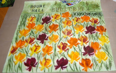
Boone Hall Butterfly Enclosure

It is with much excitement and pride that I put this post together today!  Whilst my blog has been quiet of late, I certainly haven't been - I've been making many cards for charities for the past couple of months (as well as doing some part time volunteer work) which has taken me away from the blogisphere.  However, when I saw the wonderful inspiration photo over at the Pixels and Paper Challenge Blog, I felt that I simply had to join in!
Aren't those colours glorious?!!  I had the seed of an idea forming as soon as I saw this photo, and I knew my layout page was going to be more about the creative side of making my background, rather than the photos (not normally how I create a page, but hopefully for this one you will understand why when you see the background...)
I have replicated the field of tulips on my background using the faux silk technique.  I used my 'Lotus Blossom' stamp set from Stampin' Up! which is a layered stamp.  I also used a combination of ink colours from Stampin' Up and Hero Arts Shadow Inks.  Starting with a plain white 12x12 sheet of cardstock, I put a piece of white tissue paper over it and taped it into place.  I then set about randomly stamping the lotus blossom image with the different colours to show variegation of the flowers.  I stamped onto the dull side of the tissue paper, allowing the ink to bleed through to the white base.  I then used two different green inks to stamp the two layered stem images from the stamp set randomly to fill in the blank areas.

I then removed the tissue paper and set it aside to dry out.  I sponged some the green ink into the blank areas around the flowers on the white cardstock that had bled through the tissue paper in the stamping process.  This was to add some depth to the green behind the tissue paper.

Once the tissue paper had dried out, I gently scrunched it into a ball, rolling it around to create creases.  I then carefully opened up the sheet again, being careful not to smooth out the creases I'd just created!  I used a gluestick on the cardstock across the entire area of the tulip field, and then carefully aligned the scrunched tissue paper over the glue and patted it into place, making sure I still had plenty of creases for the faux silk texture.

Then there's more sponging of green ink around the flower images and across the top of the page.  I randomly stamped images from the 'Lovely as a Tree' stamp set by Stampin' Up! across the top, beyond my flower field.  I then sealed the entire page with Crystal Effects.  As my Crystal Effects were drying, I had accidentally left a wet wipe near the top of my page.  Well, actually more likely it was on the page (d'oh!)  Anyway, the resultant "water effect" was not what I had in mind (!) and so I tore away that part of the page and used one of my butterfly photos to fill the gap - clever, huh?!!
 
Then I just really set about creating the title, matting and placing the photos on the page and tried to make them stand out from the background a bit (with white doodling and the use of string and white-embossed chipboard butterflies (from Dusty Attic)).  Truthfully though, I'm really just into the background of this layout!  I know that the photos are more than a bit lost on the page, but I'm okay with that!!!


I hope you like my page - I had a blast making it!!!


Deb.xx

30 August 2015

Kraft+ August Challenge - Zentangle Doodling #2

I really am loving doodling at the moment, and so I wanted to make sure I could play again in the Zentangle Doodling Challenge over at the wonderful Kraft+ challenge blog
My piece this time is probably along the lines of what I was originally going to attempt, and when I had my 'lightbulb moment' yesterday, I knew how I was going to make it work!  When the challenge was first announced at the start of the month, I straight away wanted to make a lamp of sorts, and put my doodling in the 'window panes' of the lamp so they could stand out.  I'm pretty stoked with my final piece...


I had originally mod-podged kraft paper over a piece of A4 canvas paper, and there that sat for the entire month.  I would occasionally pick it up and roll it into a cylinder, trying to think how can I make this into a lamp shade?

Then, sitting at the kitchen table on Saturday morning, it hit me - use one of the awesome Mason Jars my bestie Sandra had gotten me for my birthday last year!  Righto, I was on a mission!

I cut the A4 piece of kraft-covered canvas down to size and then cut out random shapes to doodle within. I then stained a piece of vellum using a mixture of Isocol and Dylusions sprays (in Polished Jade and Postbox Red).  The vellum was then mod-podged onto the surface of the Mason Jar (with the 'stain side' facing the jar).

I soaked the back of the canvas paper with water to make it more malleable, and then mod-podged it onto the Mason Jar, over the stained areas of the vellum so they would show through the cut-outs.  I used additional pieces of the kraft paper (ripped into tiny pieces) to cover all of the joins and around the rim and across the base of the jar to completely enclose the light source.

Once it was all dry, I then doodled using a black pigment pen across the stained 'windows' of the jar, and used a white gel pen to doodle on the kraft background around the 'windows'.

I have put a tealight candle into the jar and lit it up - it is so awesome in real life!!  I'm not sure the photos do it justice, but it definitely something I will be making again!