31 May 2015

White...with 1 ~ May Challenge: Raspberry Wine

CREATE BEAUTIFUL THINGS

Getting one final entry in for this month - it's been a very busy, crafty weekend!!!  I wanted to try to enter the White... with 1: May Challenge: Raspberry Wine blog challenge.  I love the concept behind the White... with 1 blog, and the Raspberry Wine would force another girly page out of me.
I love the series of photos taken of Kaitlyn when she was at Kinder.  I actually used one of those photos for the White... with 1: Hemlock challenge in March.  I recalled one of those photos had Kaitlyn wearing a smock that had this Raspberry colour in print on it, and I knew it was the picture I wanted to feature on this page.
Using White Bazzill Double Thick Smooth cardstock, I first decided to create a mist to spritz on the page.  I added a couple of drops of Melon Mambo ink to water, and then added some Illuminate reinker to make it opaque and pearlescent.  I then spritzed the page, allowing for some drips to run down the page.  Once that was dry, I also added some drops of the Melon Mambo ink directly from the reinker.  My next feature was to use the 'Hearts' stencil and sponge more of the Melon Mambo ink through the stencil onto the page randomly.  This created a lovely varied background, within the same colour shade, for my page.

To add a bit of extra dimension to the background, I stencilled some Whipped Spackle through the TCW Mini Butterfly Collage, focussing on the splotches and cup rings.

I had won some flowers by Green Tara in a blog challenge recently.  I used my Melon Mambo reinker to ink up the bottom layer of the white flowers, and to edge the petals on the top layer as well.

To add interest to the pink photo mat behind my photo, I used the offcut strip from my 12x12 white card base and added two strips behind the photo, at about the height of my daughter's face in the photo.  This has the effect of drawing the eye into that part of the photo.  With such a cute little face, why wouldn't you?!!

I made a bow with some ribbon, and then also put a length of ribbon through a ribbon-glider brad.  I had covered the brad with patterned washi tape first, and also put a strip of the same washi tape alongside the length of ribbon.

For a final touch, I randomly scattered some Kaisercraft Epoxy Dots, and then added my title "CREATE BEAUTIFUL THINGS" FROM THE Cosmo Cricket 'Tiny Text' stickers.

I've loved how this page came together this afternoon, and it's nice to have cause to create a girly page every once in a while!

Deb.xx

Scrapping Outback ~ May White with a Twist

I was straight out of the gates when the inspiration for Scrapping Outback ~ May White With A Twist Challenge was revealed... 
Being a Western Bulldogs supporter, I was sure this would be an easy challenge for me to enter ~ I mean, all of our colours are right there (including the lush green to represent the footy grounds)...

...and then May got frightfully busy, with Mother's Day cards to make for our school stall, a Ladies' Pamper Evening to help organise, and just life in general!!

In the small hiatus between the Mother's Day Stall and the Ladies' Pamper Evening, I found a couple of photos of my son with Isabella, the eldest daughter of my bestie Sandra.  (San and I met through the Mother's Club that was formed when our eldest children were born).  These photos were taken when they were both 6, at a Little Athletics event.  John's club had a blue and white strip, and Izi's had red and black.  It seemed like a perfect fit for this challenge.
I grabbed a piece of white double-thick, smooth Bazzill cardstock to build up a background.  I tinted some Whipped Spackle with blue Gelato and stencilled it through the grungy textured part of  TCW's Mini Butterfly Collage stencil, attempting to create a sun-ray effect from the bottom right of the page.  I also mixed that same blue Gelato with some water and flicked spatters across the page.

I then used some Twinkling H2Os (Garnet and Ruby Red) to flick more spatters across the page to create the 'red' element...

...However, both of my children commented at different times that the red spatters made it look like blood.  I didn't want to hear that!  So as a result, the layout has sat for the past couple of weeks, waiting for me to get back to it.

Well, today I decided to get back to it and make it work.  I have matted the photos up on some blue cardstock.  With the larger photo, I then layered two pieces of chipboard lattice that had been heat embossed with white.  This was then layered further onto a larger piece of red cardstock, all on an angle to create interest.  The cardstock had all been distressed around the edges too.

I tore little strips lengthways from the corners of the white cardstock base to reveal some red Bazzill cardstock underneath, just to give a different look to the page (and hopefully make the red spatters look less like blood, and more like part of the design ~ LOL).

I had picked up some Cosmo Cricket 'Tiny Text' stickers from the Paper Arts Tarts Expo recently.  I added the "FRIENDSHIP" sticker to the bottom right corner of the page.

The final touch before journalling was to create my title.  I used some masking tape to create my own washi tape.  I coloured two strips up with white Gelato, and then painted the Gelato with a small amount of water to set it.  I then sealed the white to the masking tape using Ranger Glue & Sealer.  Once it was dry, I stamped "Great Mates" using the Kaisercraft 'Typewriter Font' stamps.

Overall, I'm happy with how the layout turned out, although with hindsight, I might have stencilled using red, and then only spattered with blue.  Oh well, live and learn!

Deb.xx

ARTastic Challenge Blog ~ May Challenge (Stars)

Emancipation and Freedom

It's nice to be on a roll with my scrapbooking this weekend.  I'm getting through some pages that have, quite honestly, been 'treading water' for quite a while.  When I saw the current inspiration for the ARTastic Challenge Blog ~ May Challenge, I had an inkling of what I wanted to do with it...  The inspiration is a piece of art by Sarah Beetson called The return of the young prince.  (I love how the ARTastic Challenge Blog promotes artists through their challenges!)
That's a pretty funky looking piece of artwork!!!  The criteria for submissions entered into the Challenge this month was to incorporate stars on your layout.  Well, to be honest, 'stars' is just about all that is similar between this artwork and my double layout submission!
When I went to America last year, my girlfriend and I did a bit of a 'road trip' down south.  One of our days was spent at the magnificent Boone Hall Plantation in Mt Pleasant, South Carolina.  I have many amazing photos from that day, but there was one set of images in particular that came to mind when I knew I needed to use stars...

I had taken a series of 8 photographs of a timeline on a wall in one of the original Slave Cabins.  These 8 images, when pieced together, would show me the entire timeline as it was represented on the wall (as long as you don't mind the aspect of each photo being slightly skewiff!)  This timeline (which is superimposed over the 'Stars and Stripes' flag) was on display in Slave Cabin 6, and it details the road to Emancipation and Freedom in the Black History of America. As it was so long, I knew this layout would have to be a double.

I started with two pieces of Kraft cardstock for the base.  I tore of a tiny edge from all four sides of both pieces, and then using 'Walnut Stain' Distress Ink and my ink blending tool, I inked up not only the distressed edges, but also the entire Kraft base to give a smoky feel to the page.  I then layered each of these pieces onto a Vanilla Bazzill base that had been inked around the edges with 'Old Paper' Distress Ink.

I then grabbed a piece of blue cardstock and my 'Stars' stencil from Stampin' Up!, and stencilled Light Molding Paste through the stencil, and put aside to dry.  I then masked up a piece of red cardstock with stripes and then layered Light Molding Paste across the entire sheet, removing the masked strips before it was dry.  Thus, I have my 'Stars and Stripes' representation on my page.
I printed a photo of Cabin 6 in greyscale, and then using 'Tea Dye' Distress Ink and an ink blending tool, I lightly went over the surface of the photo to give a 'sepia' tone.  This was then matted onto a piece of the Vanilla Bazzill (that had been distressed around the edges and then inked with 'Old Paper' Distress Ink).

The final touch before adding my journalling was to create the title.  Initially I was going to hand-create the title, but I didn't want to mess up the striped cardstock.  So I created a document in Word, and printed my title on the back of some Vanilla Bazzill.  This was then inked over with 'Old Paper' Distress Ink and layered up using old chipboard.
As I said, definitely removed from the inspiration artwork, however, it does meet the criteria with stars!  And it is another set of photos completed from my trip to America, so it just doesn't get much better than that!!!

Deb.xx

30 May 2015

Pixels and Paper Challenge Blog ~ May 2015

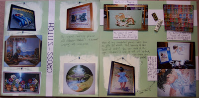
CROSS-STITCH

I'm just getting in by the skin of my teeth!  May has disappeared so quickly this year!  Between making Mother's Day cards for school and preparing for a Ladies' Pamper Evening as well, the whole month has gone by in a flash!  Thankfully I have found some time in the past couple of days to get some much-needed creative therapy done!  I wanted to make sure I could enter the Pixels and Paper May Challenge ~ the inspiration picture 'spoke' to me...
Before 'discovering' papercrafting ten years ago, my previous crafting passion and obsession was stitching.  I loved to do cross-stitch and tapestry pieces, either from kits or creating my own...  And so the embroidery hoop in the inspiration picture prompted me to create an homage to my former crafting ways...  [And a double-layout, to boot!]
I used a sage green-coloured Bazzill card for my background (green being my favourite colour).  I had cropped the photos of my completed pieces back to their frames so that I could 'hang' them on my page.  I had dry-brushed acrylic paint directly onto the Bazzill card to create a wall for each of my finished piece photos.

I have two significant pieces that are still works-in-progress:  My 'Mini Tigers' helped me through a difficult period in my life, whilst my little girl in 'Collecting Shells' matches a previously-completed kit piece 'To The Beach', which hangs at my parents' place.

Other than some basic layering of white cardstock around the works-in-progress and my awesome 'Wall of Colour', my other significant piece of background work for this double layout came from the title "CROSS-STITCH".
I paper-pierced the entire strip of cardstock and then back-stitched my title using Black DMC Rayon thread, to give my page some authenticity!

This is a very simple layout, without many bells and whistles, as I wanted it to display my keen love (although not current level of devotion) to my original crafting obsession.

Deb.xx


29 May 2015

Kraft+ Kraftboard ~ May Challenge #2

BEADS

I must confess to totally loving the May Kraftboard Challenge over at Kraft+!  The colours and tone of the Kraftboard totally matched my photos and memories of my time in New Orleans, and so I really wanted to make a second page.  Here is a reminder of how yummy the Kraftboard truly is!
My inspiration for this second page came from the orange and the beads...  Mardi Gras is an important celebration in New Orleans, and beaded necklaces are for sale in every little shop you go into.  When you look up at the street signs throughout the route the parade takes, there are just beaded necklaces everywhere, even on the traffic lights!
I felt lucky that my photo of the Canal Street sign had it's traffic lights on amber right at the time I took the shot. I also was thrilled to notice that the background behind the wall of beads in my second photo was also of an orange tone.  Thus, it all worked in beautifully to use orange for my background highlights.

My background work for this one was very simple - I tinted some texture paste with Gelatos to create the beautiful orange colour.  I stencilled it using one quarter of a 12x12 Kaisercraft stencil that had tiny circles.  I also put a smear of the paste at the bottom of my title.  Initially I wanted to stamp directly into my paste here, but this time I let it dry too much (d'oh) and wasn't able to get a clean impression.  So, I put some Glossy Accents over the dried texture paste so it would give a shiny surface to stamp upon with StazOn.  I also painted the Glossy Accents over the circles as well.

I have matted both of my photos on orange cardstock and distressed the edges.  I used my awesome circles stamp and StazOn to stamp three circles randomly within the texture paste areas.  I found some awesome blue ribbon with polka dots on it to make some circles that I then crossed over into figure-8's for some more dimension to the page.

I dug through my old Creative Memories stash to find the awesome blue patterned paper with circles on it, and used that to layer up my photos a bit more.  Then I used 6mm and 4mm 'Pumpkin' Sprinkles, and 3mm 'Sapphire' Sprinkles randomly over the texture paste circles to add a little bling.  My final touch was journalling with a 0.5 Copic Multiliner.

With this wonderful Kraft+ Challenge Blog, I just may get all of my USA photos scrapped one day!!

Deb.xx

28 May 2015

Scrapbook Boutique ~ May Challenge

Golden Wedding Anniversary

I've actually had this card made for a while now, but haven't had the time to blog about it to create my challenge entry into this month's Scrapbook Boutique ~ May Challenge.  However, the very talented DT provided me with some much-needed inspiration in their fabulous Blog Hop - thank you ladies!  Here is the inspiration photo to work from:
The gold was always going to feature in my creation, as this month is my parents' Golden Wedding Anniversary.  Their anniversary date is tomorrow (29th), however, we had a family celebration on the 15th before their yearly sojourn north to avoid the cold Melbourne winter.  Here is the card I created for them:
I started by tinting some texture paste with pink ink and stencilling that onto a white cardfront using the Stampin' Up! hearts stencil.  I set it aside to dry.  (In hindsight, I could have just chalked through the stencil instead of adding texture paste, but I do love my stencilling of paste, so I'm not too unhappy with the result!)

Using the CTMH 'Wild About Love' stamp set, I stamped the image of the two foxes using VersaMark on vellum.  I then heat embossed the images with gold embossing powder.  I also stamped and heat embossed "Happy ...TH Anniversary" using the Stampin' Up! 'Memorable Moments' stamp set.  I coloured each fox's tail with my Prismacolour pencils on the reverse side of the vellum, to add a soft bit of extra colour.

I used number dies to cut out the "50" three times using white cardstock, and once using gold foil cardstock.  These were stacked together to create dimension (with the gold foil numbers on top, of course!!) and then stuck to the vellum.

I was conscious of my adhesive showing through my vellum, so I used Glue Dots 'Vellum' adhesive to stick it to the cardfront with the stencilled hearts texture paste.  It was never going to fully stick down, given the change in dimension on the background sheet.  So I used a pink satin ribbon and some Helmar 450 glue to fold my ribbon around both the vellum and the cardfront, thus creating a frame for the card which also served the purpose of hiding adhesive and keeping the two pieces together.  I then adhered the whole onto a cardfront and wrote my message inside the card.

Fifty years is such a long time to be married, and my parents are an inspiration to me in my own marriage.  Congratulations Mum & Dad!

Deb.xx

Kraft+ Kraftboard ~ May Challenge

Books

WOW!  Can anyone tell me where the month of May has gone?!!  I have just a few days left to enter into my favourite blog challenges ~ so much to do, so little time!

I wanted to make sure I did have my entry for the Kraft+ May Kraftboard Challenge.  This is such a wonderful challenge blog, with a marvellous DT and awesome sponsors.  Here is the totally fantastic Kraftboard for the month of May!
This Kraftboard is simply divine!  It provided me with the inspiration for the selection of my photo and topic of my page - BOOKS - as well as providing me with my favourite colour to work with - GREEN!

When my best girlfriend and I went to America last year (wow, almost one whole year ago!), we travelled to New Orleans.  What a city!  We found these amazing little second-hand bookshops in the French Quarter.  These places had to be seen to be believed.  Floor-to-ceiling stacks of books ~ everywhere!  And there was that beautiful smell that only comes with old books ~ sort of musty and earthy, especially in the heat of a New Orleans summer!  (You probably wouldn't want to go in there if you were claustrophobic!)
I have started with a piece of Core-dinations Kraft cardstock.  It is a 'warmer' shade of Kraft that I felt would go well with my photo.  I tore a small edge of each side to distress and inked with Tea Dye Distress Ink.  I then rolled and teased up the corners.  It has been matted onto a piece of dark brown cardstock.  My photo has also been matted on that same dark brown cardstock.

Using some DecoArt Crackle Paste and the TCW Mini Bricks stencil to create the brickworkon the background.  Once it was dry, I used some Making Memories acrylic paint in Chartreuse and rubbed it into the crackled paste with my fingertip.  I also used some Zing! Embossing Powder in Leaf on the background.  I didn't have a specific stamped image to use, so I just heated the Kraft cardstock from underneath, then applied some loose embossing powder and reapplied the heat from underneath so it would melt.

I scrunched up a page out of an old novel and then applied Tea Dye Distress Ink, then tore it into strips and used it to add layers and depth to my page behind my photo.  I also used a few small pieces of lime-green coloured cardstock that had been hand-torn as well.

To replicate the string around the books in the Kraftboard, I used some dark brown hemp cord, cut to random lengths with knots tied at each end.  This lies under the photo and comes out the sides randomly.  My final touch was a white tag that has been distressed with Old Paper Distress Ink, with the details of the bookshop:  Rue Orleans, French Quarter, New Orleans, Louisiana.  I added some journalling to the bottom of my page and it is done!

I'm off to create something else now!  Thanks for visiting!!

Deb.xx