14 September 2015

Special Cards for Special People

18 Birthday Wishes and a Tardis...

I have two special cards to share today...  The first is for a young man who is turning 18.  Without knowing much about him, I decided to play it safe and make a timeless sort of card.  This has totally been "CASE'd" from Pinterest here:
My second card (which I started first...) is for a young man who is turning 9.  He loves Dr Who and so I wanted to be able to make him a special card.  My problem though, is I know absolutely nothing about Dr Who!!  I didn't even know what a 'Tardis' was/is...  So I needed help with this and once again, I have "CASE'd" this design from an image posted on DeviantArt:
Very special birthday wishes to both of these wonderful young men!
Cheers!
Deb.xx

08 September 2015

A 'special order' card

Lego Card for Connor

Several months ago, I was asked by one of our lovely office ladies at school if I would make a 6th Birthday Card for her son Connor.  She had seen one of my earlier samples of a Lego card and wanted the same for her son.

Well, as happy as I was with my first attempt at a Lego Card, I knew I could make something even better...
I am rapt with how this turned out, and Kerry loves it too.  Happy 6th Birthday to Connor for tomorrow!!!

Deb.xx

07 September 2015

Butterfly Cards for DEBRA

It feels very strange for me to put "DEBRA" in my title, or in fact in any written form anywhere ~ you see, that is my name on my birth certificate, driver's licence, medical records etc.  However, I'm only ever known as "Deb", and whenever someone (usually my mother) cracks out a "Debra!", I'm usually in trouble!!!

Having said that, I'm sure I can overcome a bit of discomfort for the cause behind the acronym DEBRA, being the Dystrophic Epidermolysis Bullosa Research Association.  Epidermolysis Bullosa is a rare disease whereby the skin blisters and peels at the slightest touch. Living with EB has been likened to living with third degree burns. It is very painful, and sufferers must be bandaged every day with dressings to protect and medicate their wounds. Children who have this disease are often called 'butterfly children' because their skin is as fragile as a butterfly's wings.

I have recently begun making cards to send to DEBRA Australia. This is a not-for-profit, volunteer-based organisation that does not receive any direct Government funding. They use butterfly cards to thank sponsors and to send to the families of children affected by (EB).

Here are my first contributions
Butterfly Die is from Stampin' Up! ~ Butterflies Thinlits

Butterfly die is from Nini's Things ~ Butterfly Collection
Using one sheet each of two separate designs from the Stampin' Up! "Irresistibly Yours Specialty DSP", I sponged Distress Ink over the paper, cut the butterfly dies out of black cardstock, and also put Lutradur Medium (that had been tinted with Dylusions Spray Ink) behind the wings to show through the negative space and to capture the delicacy of the wings.  I was able to get six card-bases out of each sheet of DSP.  So that's 12 generic cards that are ready to be sent off.  I may very well do this again over the next couple of days so I can send a bigger batch of cards...

Deb.xx

06 September 2015

Pixels and Paper Challenge Blog - Well Hello September!

Boone Hall Butterfly Enclosure

It is with much excitement and pride that I put this post together today!  Whilst my blog has been quiet of late, I certainly haven't been - I've been making many cards for charities for the past couple of months (as well as doing some part time volunteer work) which has taken me away from the blogisphere.  However, when I saw the wonderful inspiration photo over at the Pixels and Paper Challenge Blog, I felt that I simply had to join in!
Aren't those colours glorious?!!  I had the seed of an idea forming as soon as I saw this photo, and I knew my layout page was going to be more about the creative side of making my background, rather than the photos (not normally how I create a page, but hopefully for this one you will understand why when you see the background...)
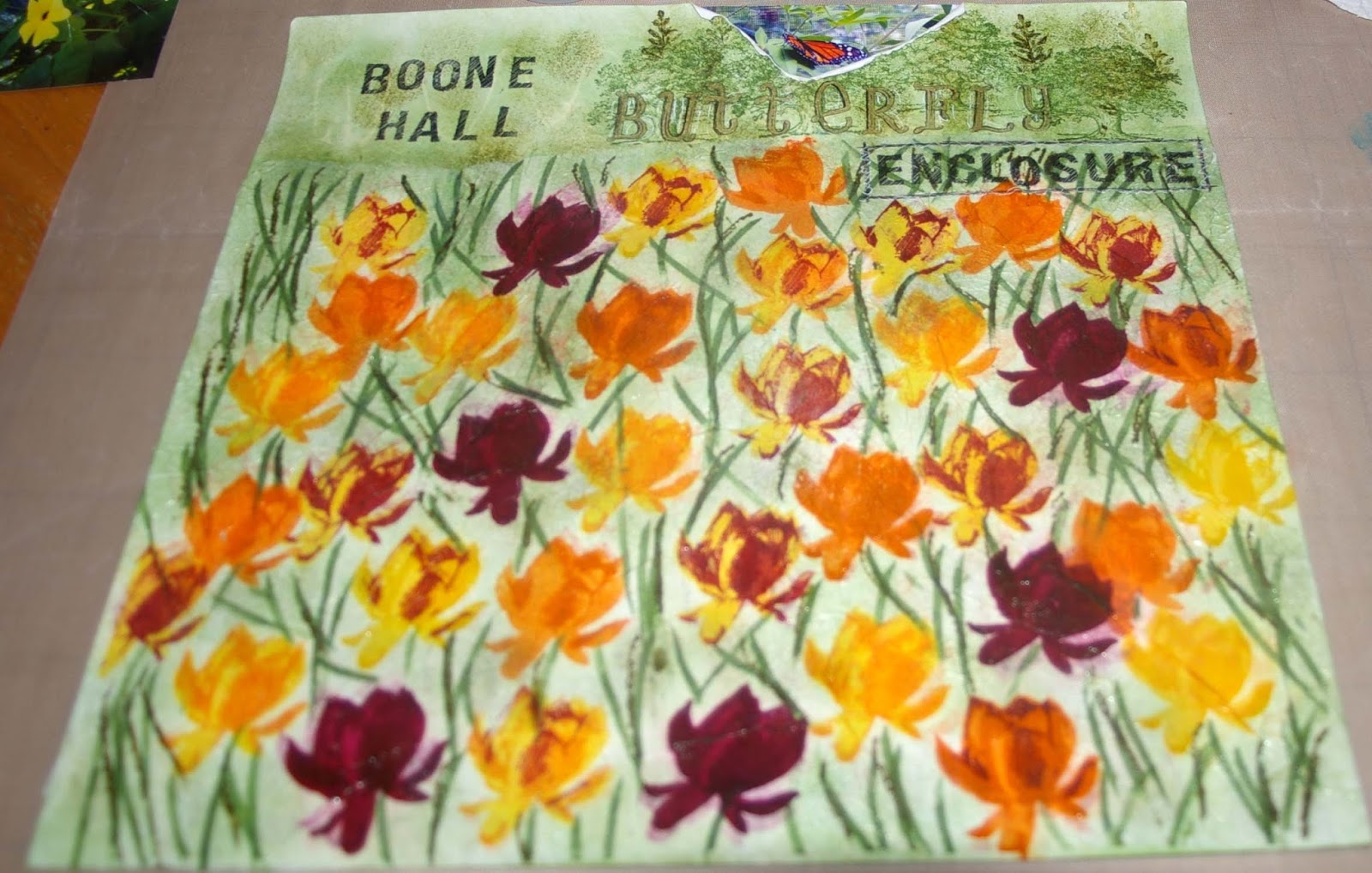
I have replicated the field of tulips on my background using the faux silk technique.  I used my 'Lotus Blossom' stamp set from Stampin' Up! which is a layered stamp.  I also used a combination of ink colours from Stampin' Up and Hero Arts Shadow Inks.  Starting with a plain white 12x12 sheet of cardstock, I put a piece of white tissue paper over it and taped it into place.  I then set about randomly stamping the lotus blossom image with the different colours to show variegation of the flowers.  I stamped onto the dull side of the tissue paper, allowing the ink to bleed through to the white base.  I then used two different green inks to stamp the two layered stem images from the stamp set randomly to fill in the blank areas.

I then removed the tissue paper and set it aside to dry out.  I sponged some the green ink into the blank areas around the flowers on the white cardstock that had bled through the tissue paper in the stamping process.  This was to add some depth to the green behind the tissue paper.

Once the tissue paper had dried out, I gently scrunched it into a ball, rolling it around to create creases.  I then carefully opened up the sheet again, being careful not to smooth out the creases I'd just created!  I used a gluestick on the cardstock across the entire area of the tulip field, and then carefully aligned the scrunched tissue paper over the glue and patted it into place, making sure I still had plenty of creases for the faux silk texture.

Then there's more sponging of green ink around the flower images and across the top of the page.  I randomly stamped images from the 'Lovely as a Tree' stamp set by Stampin' Up! across the top, beyond my flower field.  I then sealed the entire page with Crystal Effects.  As my Crystal Effects were drying, I had accidentally left a wet wipe near the top of my page.  Well, actually more likely it was on the page (d'oh!)  Anyway, the resultant "water effect" was not what I had in mind (!) and so I tore away that part of the page and used one of my butterfly photos to fill the gap - clever, huh?!!
 
Then I just really set about creating the title, matting and placing the photos on the page and tried to make them stand out from the background a bit (with white doodling and the use of string and white-embossed chipboard butterflies (from Dusty Attic)).  Truthfully though, I'm really just into the background of this layout!  I know that the photos are more than a bit lost on the page, but I'm okay with that!!!


I hope you like my page - I had a blast making it!!!


Deb.xx

30 August 2015

Kraft+ August Challenge - Zentangle Doodling #2

I really am loving doodling at the moment, and so I wanted to make sure I could play again in the Zentangle Doodling Challenge over at the wonderful Kraft+ challenge blog
My piece this time is probably along the lines of what I was originally going to attempt, and when I had my 'lightbulb moment' yesterday, I knew how I was going to make it work!  When the challenge was first announced at the start of the month, I straight away wanted to make a lamp of sorts, and put my doodling in the 'window panes' of the lamp so they could stand out.  I'm pretty stoked with my final piece...


I had originally mod-podged kraft paper over a piece of A4 canvas paper, and there that sat for the entire month.  I would occasionally pick it up and roll it into a cylinder, trying to think how can I make this into a lamp shade?

Then, sitting at the kitchen table on Saturday morning, it hit me - use one of the awesome Mason Jars my bestie Sandra had gotten me for my birthday last year!  Righto, I was on a mission!

I cut the A4 piece of kraft-covered canvas down to size and then cut out random shapes to doodle within. I then stained a piece of vellum using a mixture of Isocol and Dylusions sprays (in Polished Jade and Postbox Red).  The vellum was then mod-podged onto the surface of the Mason Jar (with the 'stain side' facing the jar).

I soaked the back of the canvas paper with water to make it more malleable, and then mod-podged it onto the Mason Jar, over the stained areas of the vellum so they would show through the cut-outs.  I used additional pieces of the kraft paper (ripped into tiny pieces) to cover all of the joins and around the rim and across the base of the jar to completely enclose the light source.

Once it was all dry, I then doodled using a black pigment pen across the stained 'windows' of the jar, and used a white gel pen to doodle on the kraft background around the 'windows'.

I have put a tealight candle into the jar and lit it up - it is so awesome in real life!!  I'm not sure the photos do it justice, but it definitely something I will be making again!

11 August 2015

Kraft+ August Challenge - Zentangle Doodling

love to CREATE

Well, it's been a while!  I've been so busy making cards for charities that I haven't had much time to create anything for any challenges.  However, when I saw this month's Kraft+ Zentangle Doodling challenge, I just knew I had to give it a go!
It's a very simple design, and will now form a piece of artwork in my craft room...
I hope you like it!
Deb.xx


15 June 2015

Pixels and Paper Challenge Blog ~ Guest Designing for June 2015

A Rainbow on my House

How exciting! 
I was thrilled to be asked to be Guest Designer on the Pixels and Paper Challenge Blog for June.  Such a fascinating inspiration photo - so many different possibilities...
I decided to focus on the rainbow colours of the hot air balloons, and drew my inspiration from there.  I love the photo that I've scrapped here.  A friend of mine took this photo driving down my street one stormy summer afternoon:  the rainbow appeared to sit on my house!
I started with a piece of light grey Bazzill cardstock and tore off the edges from all four sides.  I distressed the corners and some of the torn edges, and then ran my Ink Blending Tool with Pumice Stone Distress Ink around the edges.  I had pre-mixed some gold Gelato with water, and used this to spritz across my page (not very clear from the photo, unfortunately).  I then matted my light grey cardstock on some darker grey cardstock, and matted my photo on a banner cut from the same colour. 

Once I knew where I wanted to place the photo, I used an array of rainbow-coloured Twinkling H2O's to create my own rainbow on the background.  I put dots of the colours in a line up the page.  I was going to leave the background rainbow like that, but it didn't quite look right.  So, once the dots were dry, I ran a wet brush along each colour line to blend out the watercolour.

I had torn some strips from a random piece of patterned paper (it had grey-blue tones), and I distressed these torn strips with water, and then lightly inked them with Pumice Stone Distress Ink.  These were then layered with some rayon thread (again, not terribly visible in the photo).

I stamped out my title using Stampin' Up! 'Notable Alphabet' and 'Sketch Alphabet & Numbers' and added some white inking to the top to mimic clouds.  I added my doodling in white gel pen, and there you have it!

I was super excited to participate in this challenge as Guest Designer - this is my first design spot of any sort in the blogging world, and I'm pretty chuffed about it!  Thank you Jane!

Thanks for dropping by!

Deb.xx